The color of an executive desk shapes mindset and signals a professional identity. In any home office or corporate office, the right choice can improve focus and clarity.
This introduction frames five practical palettes and links each to ergonomic tips and real-world use. Readers will find clear information about how shades affect cognitive load and mood.
Selection matters whether one designs a home workspace or updates an office zone. A well-lit space with a considered color palette helps sustain deep work and reduces visual strain.
This guide moves beyond vague advice. It explains how color schemes, from airy whites to rich tones, influence daily routines and the atmosphere of a workspace. The result is a desk that supports focus and projects authority.
The Psychology of Color in Your Workspace
The paint you pick can change how a workspace feels and functions. In a home office and an office setting, subtle hue choices shape attention and energy.
Benjamin Moore provides a robust home office paint palette with muted, thoughtful tones. These options deliver a satisfying dose of color without causing distraction.
The psychology of color suggests that certain shades can fuel focus and spark creativity. Designers select paint to influence mood and to create a calm, organized workspace feel.
Research shows the colors surrounding a person affect mental state and task efficiency. That information helps teams and individuals make reasoned design choices that support long work sessions.
- Muted tones reduce visual fatigue.
- Contrasting accents can raise alertness.
- Neutral schemes promote steady concentration.
The Best Desk Colors for Productivity and Focus
Choosing the right surface tone can shape how clearly someone thinks during long work sessions. A subtle surface hue interacts with room light and sets a calm stage for focus.
When evaluating the best desk colors for productivity, consider how the surface reads in your home office and a traditional office. A dark finish absorbs light and can add seriousness. A light finish reflects light and opens the space.
- Check how the surface looks at different times of day and under task lighting.
- Decide whether choose a neutral paint or a subtle accent to reduce visual noise.
- Pair paint and surface to create a clean, uncluttered work area that can boost productivity.
This information helps someone match a surface to their work style. Many professionals prefer neutral tones because they do not compete with other elements in the home or office. The right combination supports sustained attention and makes complex tasks easier to manage.
Harnessing the Authority of Dark Tones
Deep, muted tones can anchor a workspace and signal authority at a glance. In a home office or corporate office, charcoal and espresso add weight without cluttering the room. Dark color choices create a clean visual plane that helps the mind settle into focused work.
The Impact of Matte Finishes
A matte finish reduces glare and eases eye strain. OSHA guidance highlights glare management to prevent visual fatigue. Selecting a low-reflective finish is a practical choice when planning a home or shared office.
Professional Presence
One creative director, Robert Vidaure of California, painted his corner charcoal black to make accessories pop. The Ark Pro L-Shaped Standing Desk with Lauren Black Gold sintered stone offers a durable, glare-resistant top and an authoritative look.
- Dark tones help you feel grounded and professional.
- Matte finishes comply with glare guidance and reduce distractions.
- They provide a sophisticated backdrop that makes office items stand out.
“A measured dark palette gives an executive space stability and clarity,”
Creating Warmth with Natural Wood Finishes
Natural wood finishes bring a quiet warmth that reshapes how a workspace feels. Wood tones add an inviting touch without overwhelming a home office or corporate office.
The Ark EL Executive Standing Desk uses an original oak texture veneer to introduce vintage charm and a tactile finish that suits a modern home office.
Kris Villano, a multimedia artist from the Philippines, paired limewash paint with reclaimed wood to create a cozy industrial style in his office. That look supports daily work and sparks creativity.
Integrating Organic Textures
Natural surfaces help reduce stress by connecting an office to the organic world. A visible grain makes the space feel like an extension of personal style.
- Choose a wood finish with clear grain to add a warm look and subtle personality.
- Select finishes that pair well with your paint choices to maintain balance in the room.
- Use wood tones to make workspace feel approachable and professional while helping reduce visual fatigue.
“A touch of wood brings a human scale to modern work setups.”
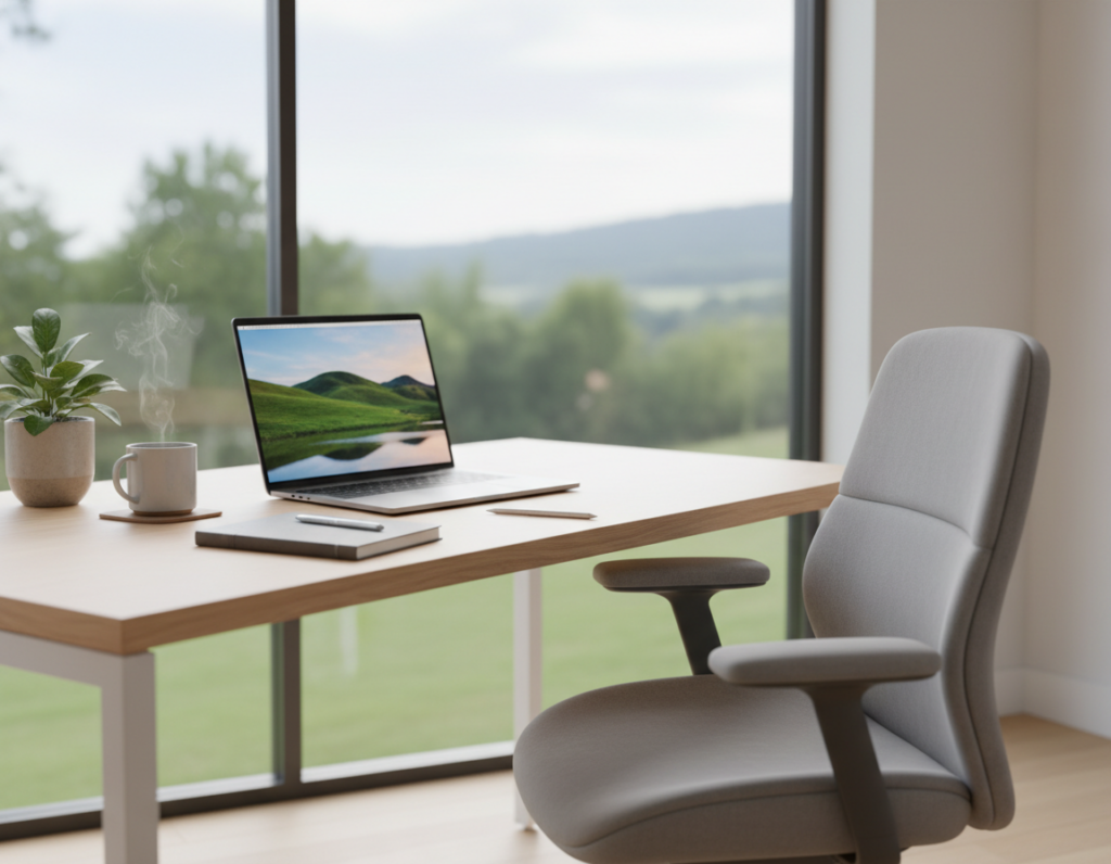
Achieving Mental Clarity with Light and White Surfaces
A pale surface acts like a calm stage, reducing visual clutter and easing focus. Light and white finishes simplify the workspace and make small spaces feel larger.
The Zen Classic Executive Standing Desk with its 86″ width creates an expansive presence that keeps an uncluttered atmosphere in a home office.
Designers such as Enzo Salvador and Eloy Rodriguez use a white palette to integrate an office and to sustain a warm, professional atmosphere.
Bogdan Patraucean shifted to light themes to keep consistency and clarity while coding and reviewing information in his home office.
- A matte finish on a white surface reduces glare from natural light and protects visual comfort.
- A white backdrop makes accents and personal touches stand out without overwhelming the space.
- Light tones help reflect natural light and create an open atmosphere in compact spaces.
“White surfaces can act as a neutral backdrop that supports extended focus,”
Practical note: choose low-sheen paint and finishes to avoid reflection. This keeps the atmosphere calm and preserves mental clarity during long work sessions.
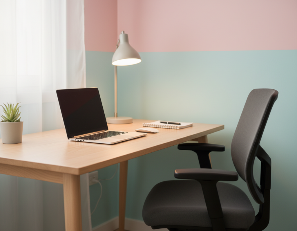
Incorporating Cool Tones for Sustained Concentration
Introducing cool hues into a workspace can make sustained concentration feel easier. These tones calm the eye and reduce mental clutter, which helps when someone handles dense information or long tasks.
Blue for Intellectual Tasks
Blue supports analytical thinking and steady attention. Slate Teal 2058-20 blends blue and green to give an office a luxurious, calm feel. Use this shade on an accent wall to frame monitors and paperwork without causing distraction.
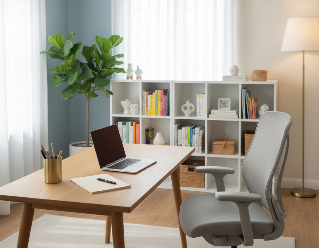
Green for Harmony
Green brings balance and a quiet energy. Tanja Renate Aakerøy uses Olivenlund by Butinox to create a serene zone that aids deep concentration.
Adding plants, as Detrik Vanderlinden does, reinforces that harmony and lowers stress while someone works in a home office.
Using Accents Effectively
Accents add contrast without overwhelming a small space. Ashley Sainato pairs an orange chair with cool walls to spark energy during long work hours.
- Keep the main surface neutral and use one vivid accent near the work area.
- Hand-painted botanical shapes, like Stefana Teodoroiu’s, bring nature indoors and aid focus.
- Choose paint and accents to balance light and reduce visual fatigue.
For deeper reading on how hue choices affect attention, consult research on color psychology.
Debunking the Myth of Aesthetics Versus Ergonomics
A polished aesthetic and practical ergonomics can coexist in modern workspace design. A well-made home office can reflect personal style while meeting health guidelines.
The Canadian Centre for Occupational Health and Safety (CCOHS) offers clear steps to adjust a desk to ideal posture. Cornell University’s Ergonomics Web adds the “20-8-2” rule (20 minutes sitting, 8 minutes standing, 2 minutes moving) to structure a healthy workday.
People often ask whether choose a beautiful desk or one built for long hours. The right selection blends thoughtful design, reliable mechanisms, and finishes such as paint and subtle colors that match a room without sacrificing function.
- Follow CCOHS guidance to set height and reach.
- Use the 20-8-2 rhythm to reduce strain during the workday.
- Pick an executive solution that supports posture and preserves home or office style.
“Modern executive furniture proves that aesthetic and ergonomics need not compete.”
The Role of Lighting and Sheen in Your Office Design
The way a space is lit often matters as much as paint or finish when creating a functional home office. Light and surface sheen work together to shape comfort and clarity.
Managing Glare and Reflection
Control glare to prevent visual fatigue. OSHA guidelines stress that managing reflections is key to protecting eyes in any office.
Use a mix of task lighting and ambient light to keep contrast steady across screens and paperwork. Benjamin Moore recommends balancing these sources to sustain comfort during long hours.
- Choose low-sheen paint and matte finishes on a desk top to reduce mirror-like glare.
- Place task lamps to illuminate paperwork without shining into monitors or eyes.
- Adjust an accent wall so it has even illumination and no harsh reflections.
This guidance helps the home worker and office planner make choices that protect concentration. By pairing the right light with thoughtful finishes, the space supports long workdays and steady information processing.
“Proper lighting design is essential to a professional, visually comfortable office.”
Practical Tips for Selecting Your Ideal Desk
Smart selection blends light, scale, and accents to support focused work. Start by testing paint samples like Benjamin Moore’s Beneath the Clouds 2131-50 and Ballet White OC-9 in your home office. See how each reacts to natural light at different times of day.
Consider personal style and function. Rina Miele uses yellow accents in her office to lift mood. Kei Yoshikawa adds pink touches to make her home feel safe and unique. These small accents shape how a space feels without requiring a full redesign.
- Scale the solution to your office so the look fits available spaces and storage needs.
- Test paint near your work area to gather real information about glare and hue.
- Choose a matte finish to reduce reflection, keeping the surface professional without overwhelming the room.
- Use an accent wall or subtle accents like a green lamp or cushion to define a zone and support focus.
When deciding whether choose a specific desk, match the surface and color scheme to how someone works. This approach helps keep the home and office connected while protecting clarity and comfort.
“Small, intentional choices often make the biggest difference in daily focus.”
Conclusion
Choosing a surface hue is a small move with a big impact on how one spends the workday. In a home office or an office, the right paint and surface choice shapes mood, light handling, and overall focus. The executive desk becomes the heart of a productive workspace when paired with a calm palette.
Natural light, a touch of green, and a subtle accent can make a home space feel like a sanctuary. These colors help reduce visual noise and improve concentration without demanding a full redesign.
Use this information to match personal style and function. The right desk and color palette will help maintain balance, boost creativity, and make sustained focus easier during long hours of work.